Your storefront
It should look like your shop.
Not like our software.
Your colors, your fonts, your photos, your words, on your own link. Have a play with every option, then go and make yours. Some of them come with Advanced.
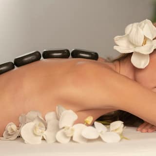
Velvet Hour Spa · Day spa
Dark only, a classic serif, square corners and lots of room.
Try this look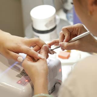
Sugar Rush Nail Bar · Nail bar
Hot pink, pill buttons, big rounded type and cards that float.
Try this look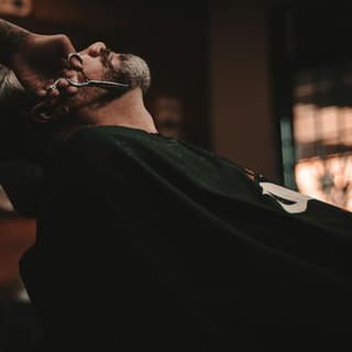
Lineup Barber Co. · Barbershop
Black and white, a poster font, square everything, no shadows.
Try this look
Rootwork Braid Studio · Braid studio
Earth tones, a soft serif, very round corners, sections on panels.
Try this lookFour designs
A tattoo studio and a bridal salon are not the same shop
So they should not be handed the same corners. Pick the one that feels like you, and everything on your page follows it.
Bed-Stuy, Brooklyn
Structured gel, natural nail health, no rush.
4.9 from 312 reviews
Services
Luxury
Sharp corners, generous space, big confident headings.
Bed-Stuy, Brooklyn
Structured gel, natural nail health, no rush.
4.9 from 312 reviews
Services
Minimal
Quiet and roomy. Soft corners, almost no shadow.
Bed-Stuy, Brooklyn
Structured gel, natural nail health, no rush.
4.9 from 312 reviews
Services
Bold
Full round buttons, real shadows, headings that shout.
Bed-Stuy, Brooklyn
Structured gel, natural nail health, no rush.
4.9 from 312 reviews
Services
Natural
Rounded and gentle. Easy to read, nothing shouting.
Color
Your brand, not a theme
Set your own colors for the buttons, the accents, the page and the text. If you have brand colors already, use those. If you do not, pick what you like and it will still look right, because what sits on top of a color is worked out for you.
Type
63 fonts on Advanced, and your headings can differ from your words
Serif, sans, slab, display and script. Set one face for your headings and another for the reading, the way a real brand does it.
Light and dark
A dark mode that still looks like you
Turn it on and your brand colors stay yours while the paper underneath changes. Most software just inverts everything and turns a warm cream into mud. If you want to set the dark colors yourself, you can.
Go further
Four dials, if you want them
A style gets you most of the way. If you want to nudge it, there are four things you can turn, and every position on every one of them is a position we designed.
- Corners
- How round your buttons and cards are.
- Depth
- How much your cards lift off the page.
- Spacing
- How much room each part of the page gets.
- Headings
- How much your section titles shout.
What you will not find is a box that lets you type any number you like. That is the point. Your page is always one of ours, so it cannot end up somewhere nobody has ever looked at.
What goes on it
Build the page out of the bits you need
Show what matters to your business and leave out what does not. Services can be a grid, a list or a carousel. Your team can be a grid or a row that scrolls.
- A hero with your photo
- Services, as a grid, a list or a carousel
- Your team
- A gallery of your work
- Opening hours
- Where you are, with a map
- Reviews
- Gift cards
- Your Instagram feed
- About you
- Classes and events
- Anything else, as your own block
And your own web address
Every business gets its own booking link straight away, ready to drop in your bio, your texts or a QR code at the desk.
Make one that looks like you
Set your services up, pick a style and share your link. Essentials is free forever and there is no card to start.
No card needed. No contract. Your clients stay yours.